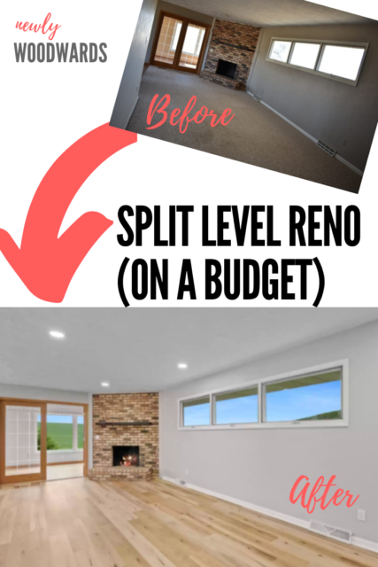
Next up to share on our split level renovation – the main living area before and after photos. This space includes the living room, dining room and kitchen. The space isn’t fully “open concept”, but has an expansive feel.
The wild thing is we didn’t do anything over-the-top here – no walls torn down, no major renovations, no brand new kitchen. But the things we did tackle helped clean, modernize and brighten the space. It’s now a beautiful space for a family.
I think it’s an amazing transformation on a budget.
This post includes affiliate links, meaning, if you click through and make a purchase I may get a commission (at no additional cost to you).
First up …
The living room
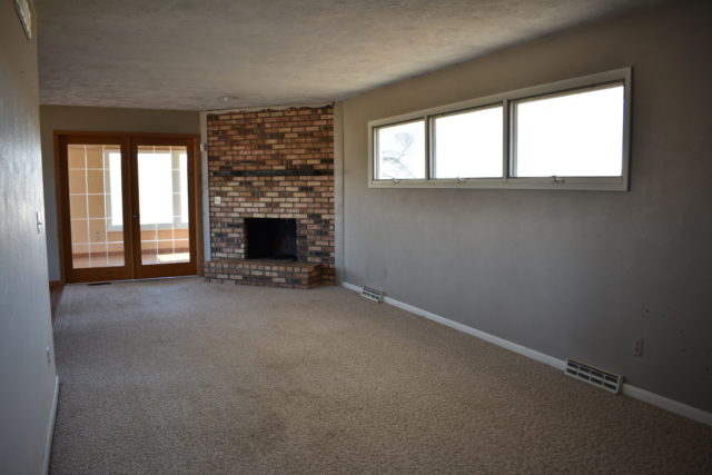
Here’s a shot of the living room with the fireplace (looking into the sunroom) before. It felt dingy and dated.
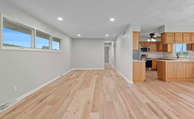
And now it’s bright and modern! I especially love how the entire house feels cohesive now – using the same flooring, wall color and trim color throughout. We also updated all the outlets and vents to make it feel fresh and clean.
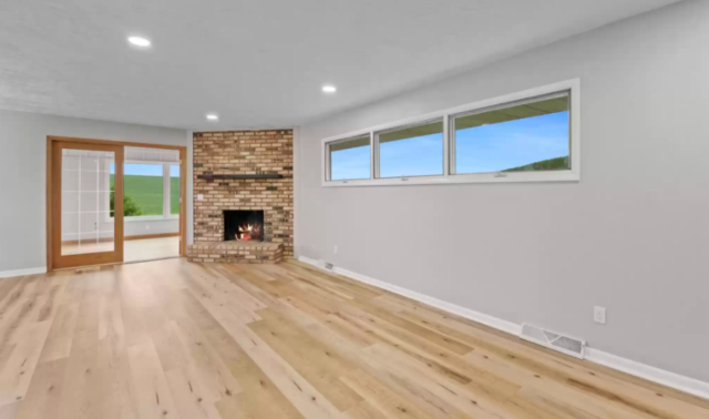
The living room also got new recessed lighting. (There was no overhead lighting before, which is relatively common in our area in older homes.) The lighting modernized the space and made the new wall color (Behr Dolphin Fin), trim and floors look better than ever.
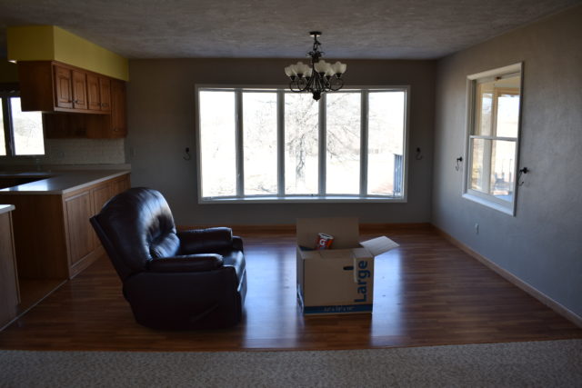
Dining room
Moving onto the dining room. This was also just plain dingy. All of the “before” photos are also not retouched, so they feel even darker than real life. But the wall colors and choppy floors didn’t do these rooms any favors.
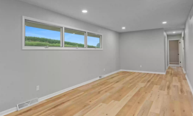
The after really spotlights the front windows – which are one of my favorite parts of the house. They have such a great country view. (To the right is the sunroom, with views for days.)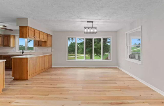
And here’s the view coming in from the sunroom. The flooring coordinates well with the existing cabinetry, but also makes the space feel more modern and cohesive.
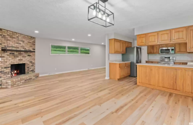
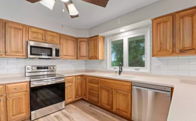
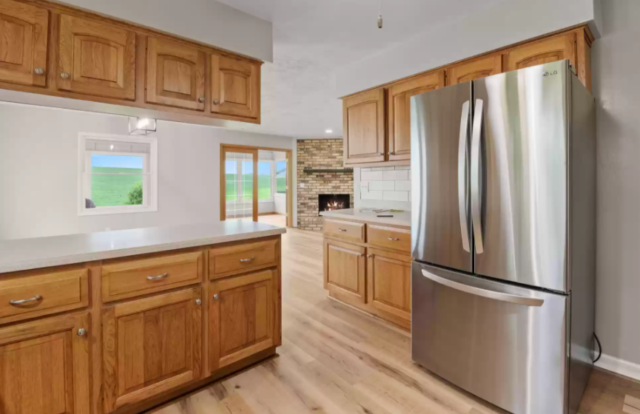
Kitchen
We did not complete a total kitchen overhaul because the kitchen was in good condition overall – with newer countertops and cabinet refacing. By focusing on paint, backsplash tile, lighting and appliances, the space got a nice update without costing a fortune.
Before, there was a painted brick backsplash, yellow walls, mismatched appliances, and 90s-style scalloped trim. I know that the 90s are coming back, but that trim and brick had to go.
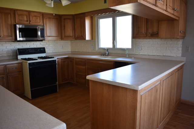
We tossed around the idea of new countertops, but the paint and white subway tile backsplash did a good job of cleaning up and modernizing the space.
There is an abundance of cabinet and counter space. And the window over the sink is wonderful! (I personally think a window over the kitchen sink is a must-have.)
If it were going to be my home, I would have probably liked to remove the soffits and the overhead cabinets adjoining with the dining room. (Let’s get real. I may have even tackled a full kitchen remodel.)
But, this would have made the project much more extensive – and so much more expensive. The cabinets were all in really good shape so we made the decision to leave all the cabinets intact. In the end, it was the right call – for the house and the project budget.
Room sources:
- Flooring: ProCore Plus English Grove Oak 7 inches wide
- Paint: Behr Dolphin Fin (walls), Behr Ultra Pure White (trim)
- Dining room light fixture: Lanhall 4-light fixture
- Light bulbs: 12-pack Edison bulbs
- Kitchen appliances: LG Stainless Steel PrintProof set
- Recessed lighting: 12-pack with junction box
What’s your favorite element? Mine is definitely the flooring!
If you like it, pin it:
It looks so good!! I love how bright and cohesive everything is now. That flooring is *chef’s kiss.*
And kudos on keeping scope in check. That’s HARD. And the results was so incredible!